
Brightwheel Design Exercise
Option 1: Home Screen

"Are those action buttons or navigation?"
Strategy & Background
With a prompt based on the actual product instead of a hypothetical, Brightwheel's design exercise is a little atypical. To avoid devaluing my work, the design provided will be limited. However, I totally understand the intent to familiarize candidates with the product – so let's jump in.
My design process typically begins with building empathy for users. Understanding the defining characteristics, attitudes, preferences and behavior of a market is imperative for creating a product that's both effective and desirable. For the purpose of this exercise, I'll rely on the following assumptions in lieu of insights about user needs that would inform the process given more time:
- My design intuition reflects the preferences of users.
- My guesses about user needs and behavior reflect reality.
- The problems I identify are the right problems to solve.
- The right scope is no broader than the affordances currently on the home screen.
Due to the brief nature of this exercise, I'll highlight more problems than solutions. My response to the prompt will include the following:
- A brief "UX audit." In the process of exploring the app via recommendations from the prompt (i.e. "try checking in a student and logging a nap"), I'll point out basic design problems that violate best practices or create confusion for users.
- A redesign of 1 screen (the home screen). Based on the prompt, my redesign will focus on best practices, usability, visual style and the previously stated assumptions (rather than knowledge of how users currently interact with the product). Sound good? Let's get started.
State of affairs (or, a UX audit)

Navigation is problematic and confusing.
Messages represent a separate environment in the app, and should be referenced with a navigation button. However, Add Activity and Check-In seem like affordances that act on the content on the current screen (kids in this room). These are action buttons, not navigation links.
Showing these dissimilar affordances in what looks like a navigation bar creates fundamental confusion about information architecture.

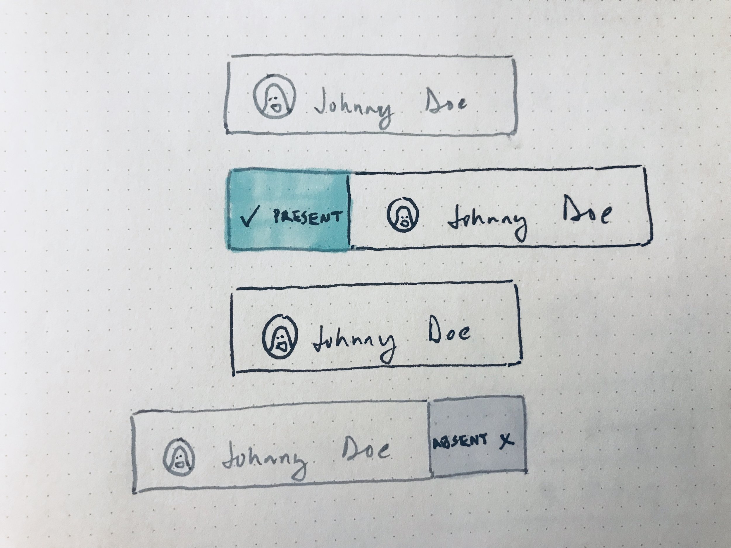
This design pattern (fading out students that are not checked-in) makes student objects look non-interactive, problematic, and even suggests an error might have occurred (are these kids loading? 🤔).
A non-completed state (student not checked in) should be designed to enable completion (i.e. check in a student who's present), rather than communicating that it's not interactive.

Visual hierarchy between action buttons and the activity feed is insufficient.
Because people read from left to right, I actually tapped the "All Activity" dropdown first when trying to add an activity. Had there been more effective visual distinction between this action area and the activity feed, it would be clear this is a filter.

An empty box with an "edit" button can't be the best way to communicate what is going on with this field.
Ideate, design, Iterate...
How might we make frequent actions quick and effortless?
The current product shows all students on the home screen, yet doesn't allow you to interact with them directly. Instead, logging an activity or checking in a student takes at least 2 steps. It seems like these actions are required often. How could we make them instant?
Ergonomically, a swipe is easier for the human thumb than a tap. It's surely easier than 2 taps. Swipe-able cards allow teachers an instant way to interact with students in common ways (more on this later).

How might we convey a clear mental model for users while prioritizing affordances that are used often?
Using space and context to create a clear distinction between navigation buttons and quick actions makes users confident and effective.
Action buttons float right in the thumb zone, allowing teachers to add activity or check students in with ease.
A list of students or a list of recent student activity is shown, depending on a switch.
Card metaphors make the interface dynamic, interactive and accessible.
Using a standard design pattern for the Student <> Activity switch eliminates the learning curve. But this switch's design suggests users can swipe anywhere onscreen to toggle between student and activity lists. This interaction would clash with swipeable cards.
A redesigned switch encourages a tap, not a swipe, for switching between students and activity.
Color adds energy. But a room card and a quick action button shouldn't be communicated with the same visual language...
A shift towards a monochrome color palette improves contrast and hierarchy – saving color for the actions a user would like to find quickly and often.
Room card design offers subdued interest, but preserves hierarchy.
Student <> Activity switch sticks to top of screen on scroll for accessibility.
Space and subtle color differentiate students based on checked-in status.
Swipe right to check a student in or out (and the card moves to the appropriate zone).
Swipe left to add an activity for a student.
Swipes gestures are visually connected to their actions with color.
Floating buttons keep important actions visible at all times.