Bright
Bringing human-centered design to an underserved market.

Bright is a renewable energy startup on a mission to bring solar power to the developing world.
Bright brings subscription-based solar power to developing markets for $0 upfront investment.
The first renewable energy investment from Y-Combinator, they're based in San Francisco but choose Mexico as their first market.
A social mission combines with an interesting market opportunity in Mexico – where sunlight is 40% more abundant than the US, and inefficient public utilities drive prices 2-3x US rates.

Current affairs
A service design problem with multiple touchpoints and improvised communication channels.
Bright endeavors to offer a high-touch, service-oriented energy alternative that’s unparalleled in Mexico. Current utilities are inefficient, unaccommodating, and rife with theft that can inflate prices for consumers in a massive way. Yet until now, their software stack has lacked any customer-facing experience.
The current experience (above, mapped by a colleague) is relegated to a disjunct system of PDF's, phone calls and text messaging. Bright wanted to see how product design could fix it.
Here are some things I observed customers (and people who decided against the service) say:
"I don't feel taken care of."
"I don't know who to call."
"What happens next? How long is this going to take?"
"I don't want to get trapped."

Choose your own adventure.
Desire lines are a powerful source of truth in designing products for people. Empowering the organic behaviors people use to attain their goals is easier and more effective than trying to shape new behaviors.
Customers navigated a complex and confusing system in myriad ways. Phone calls and in-person visits are numerous – but WhatsApp was the most prevalent communication channel. Without a tailored solution, Bright customers choose messaging. And their context is almost always mobile.
An entirely new platform built in React for mobile and mobile web brings all types of communication to a unified experience that's distinctly Bright.

Your personal concierge to the rescue.
Bright’s market of generally well-educated and financially literate Mexican consumers harbors a unique distrust for products and corporations, and places an enormous value on person-to-person communication.
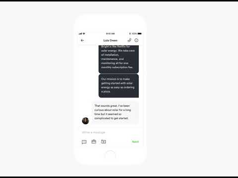
A conversational design system fosters trust by enabling a personal style of communication at scale. It brings cohesion to a lengthy and disjointed process that previously lacked an official communication channel.
One consistent person and place for all your communications. Connect over the phone with 1 tap.

An early prototype.

Engage with storytelling.
Interactive data visualizations replace PDF’s, and keep important figures a tap away.
A narrative format keeps users engaged as they navigate projections of environmental and financial impact.


A new platform to empower both sides of the table.

A redesigned Bright Ambassador product multiplies employee time and efficacy.
Bright reps can connect with their customers and colleagues in any place or context. Less reliance on in-person visits and phone calls allows customer service to scale with growth. A dedicated, always-open channel to Bright makes sure customers feel taken care of.


Outcomes
I worked on a number of projects with Bright as freelance lead designer over a 1+ year engagement. We assembled a new product team when we began work together comprised of a technical lead, 4 developers, a cofounder leading product management, and myself leading design.
The initial MVP we launched, from landing page to messaging UI, doubled lead conversion from 8% to 15% over the course of testing.
